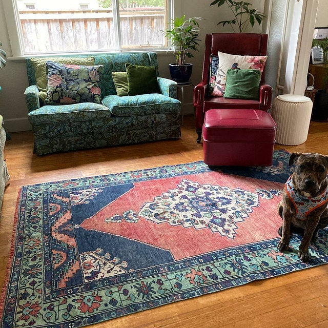


There is a particular frustration that happens in the middle of redecorating. You have photos saved, a rough sense of what you want — and then you open a rug website and end up paralyzed between three options that all seem fine and none feel right.
I'm Kadir. I personally source and wash every rug we sell, from buying trips through Anatolia to the final inspection in Cappadocia. Color is the question I hear more than any other. Here is how I actually think about it — and what I've seen make the difference for buyers who were stuck exactly where you are now.
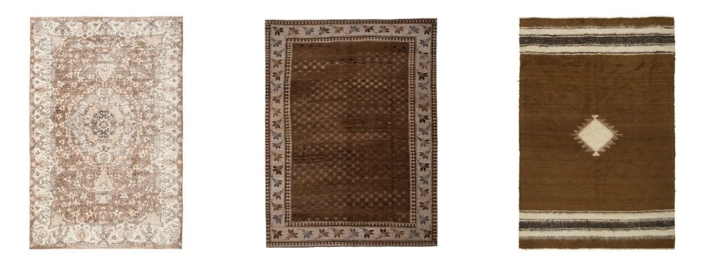
If you want to browse while you read, our turkish rugs give a good sense of how color behaves in hand-dyed wool.
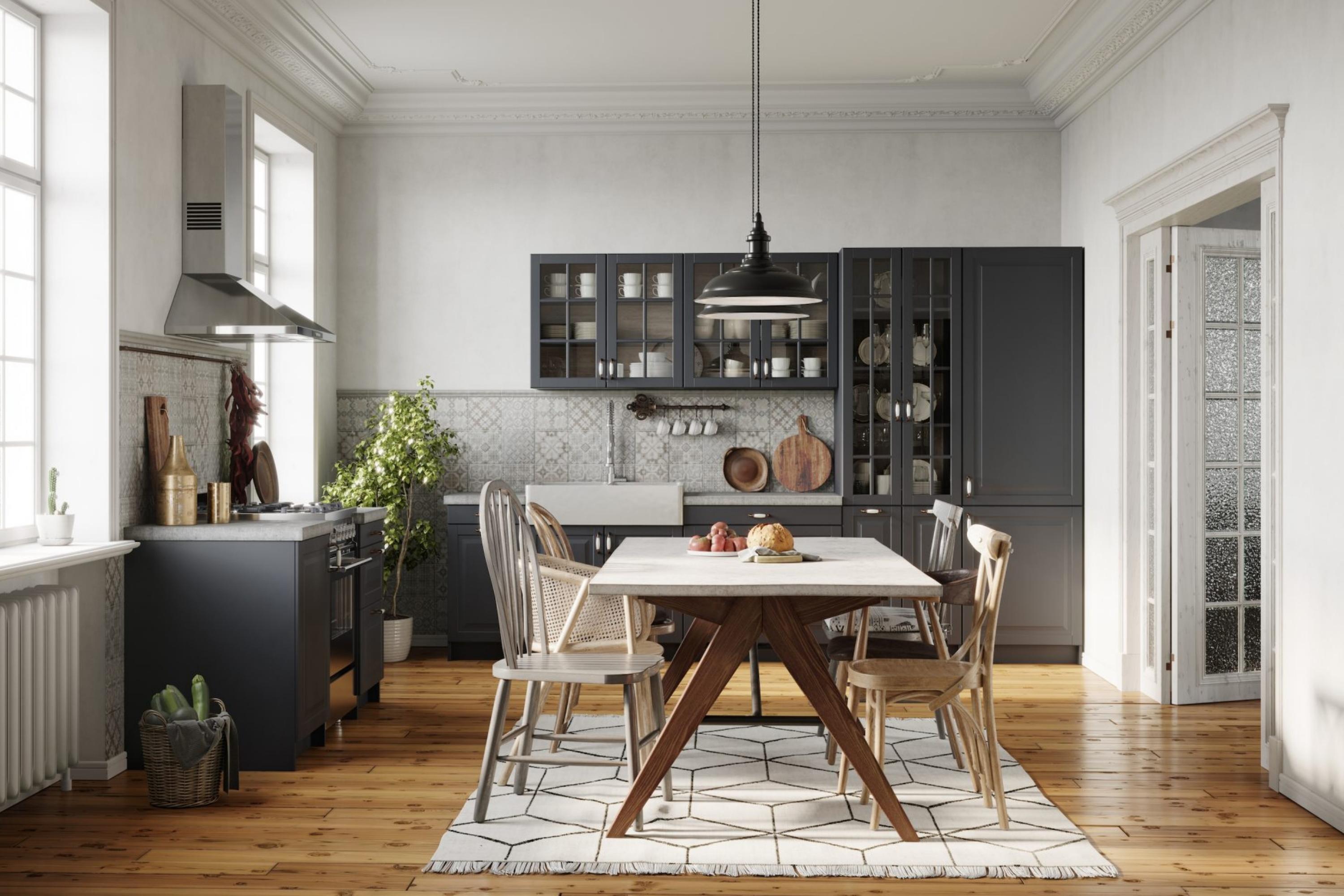
Start with what is already fixed: the floor, the walls, the sofa, the curtains, and the light. A rug should not copy the room exactly. It should echo one tone, add contrast where the room feels flat, or bring softness where the room already feels too strong.
Look first at what will not change: walls, furniture, floor, curtains, and natural light.
If your sofa has a color you love, the rug needs to echo it like one note in a chord.
Dark floors often need lift. Light floors often need grounding. The rest follows from there.
Living rooms can carry stronger color. Bedrooms usually need quieter, easier tones.
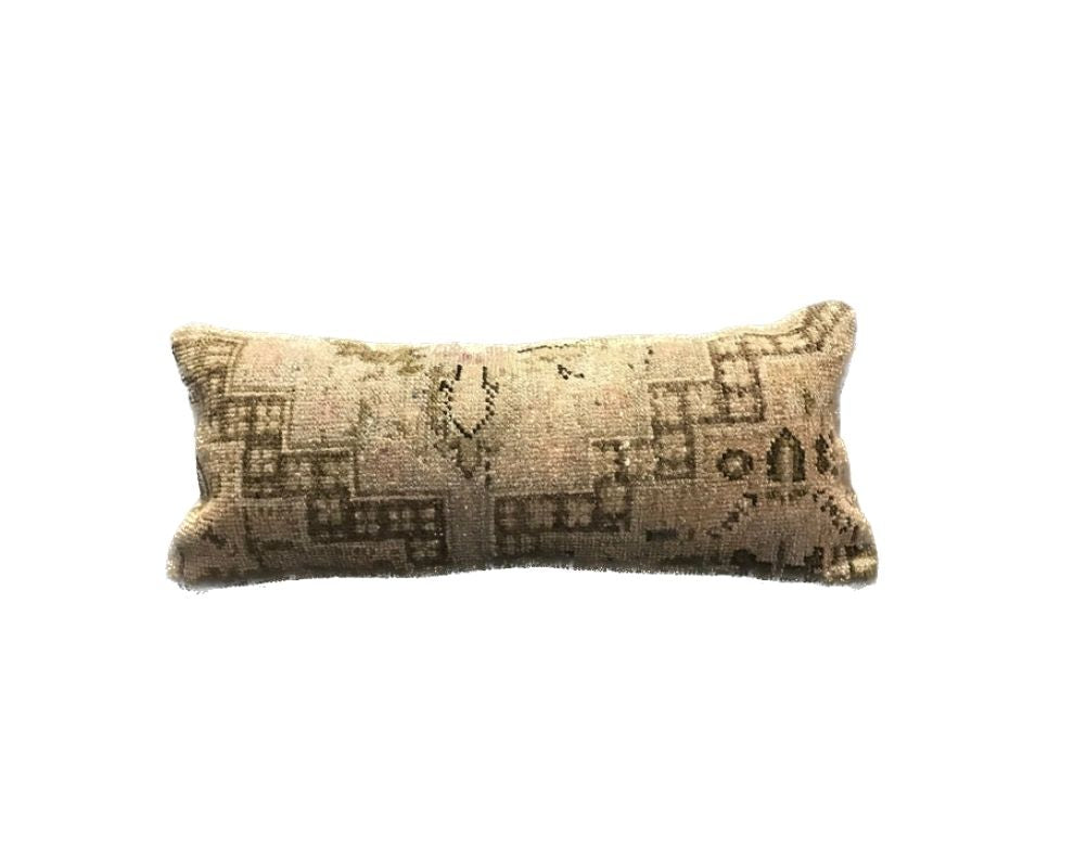
Abrash and natural dye movement are not flaws. They are what make a rug feel alive.

Start With What's Already in the Room
Before picking a color, look at what is not going to change.
Match (or Contrast) Your Walls
Walls with a strong presence — deep sage, terracotta, charcoal — sit better with a rug in quieter tones. Neutral walls are the easier case: they give you room to bring in color through the rug that the furniture can't carry alone. Look at the throw pillows or curtains you already own, find one tone you love, and start from there.
Let Your Furniture Lead the Decision
Solid-colored sofas and patterned rugs tend to work well together. Two bold patterns fighting each other is where rooms fall apart. If your sofa has a color you love, the rug doesn't need to copy it — it needs to echo it. One note in a chord, not a repetition.
Don't Forget the Floor
When someone asks me “which color should I pick,” the first thing I ask back is: what's your floor? It's the most permanent element in the room — more fixed than furniture, more relevant than wall color when it comes to choosing a rug.
A light rug against dark floors feels deliberate and defined. A dark rug on light floors grounds the room, pulls everything inward. If you tend toward pale or neutral floors, ivory and sand-toned rugs provide contrast without feeling stark.
Know the floor first. The rest follows. For specific floor-to-rug pairings, see the quick reference table near the bottom of this article.

The Best Rug Color for Each Room
Living Room
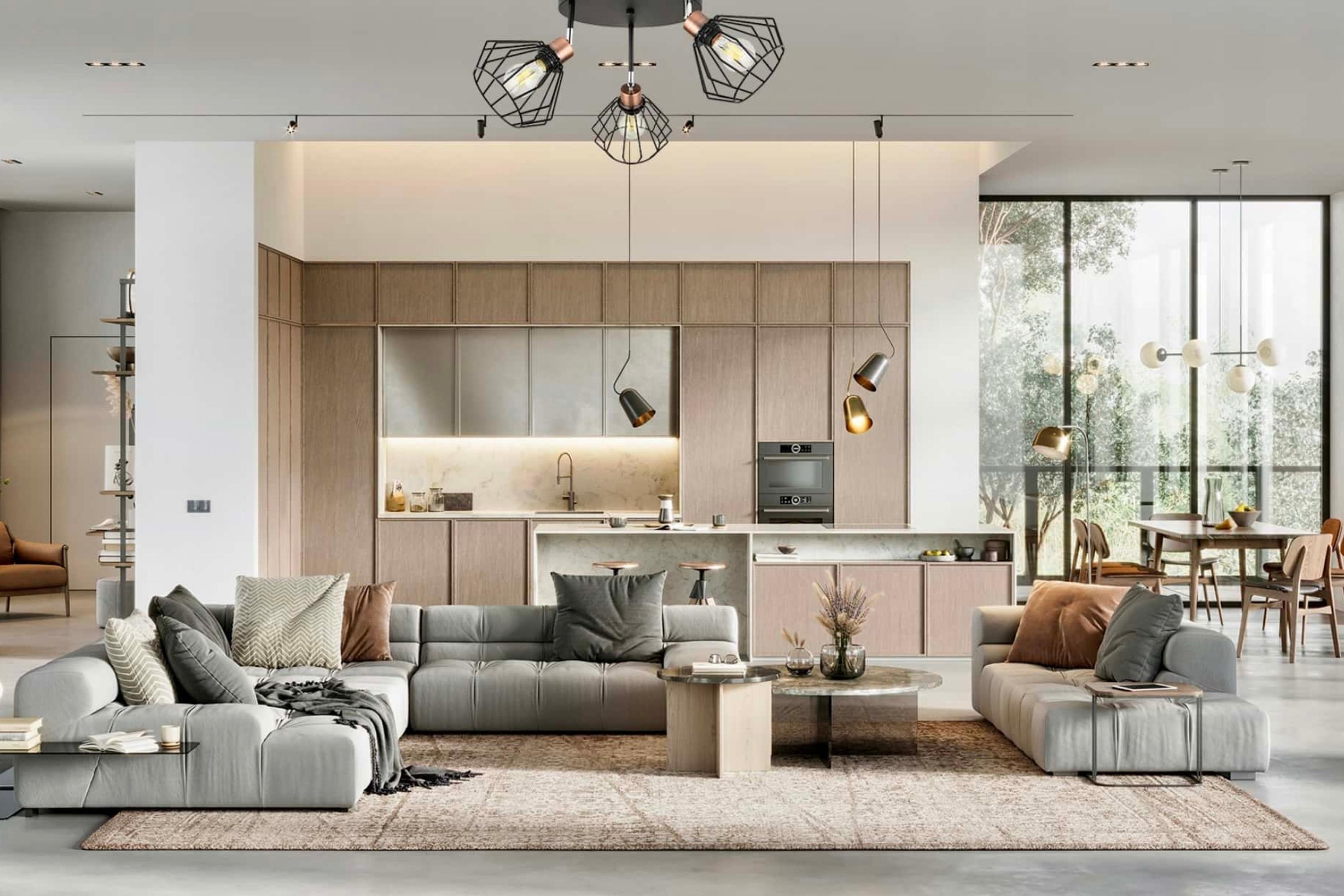
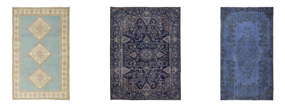
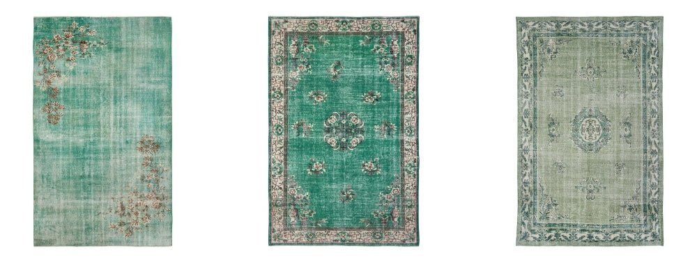
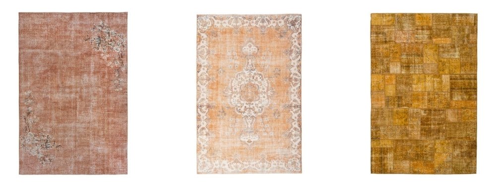
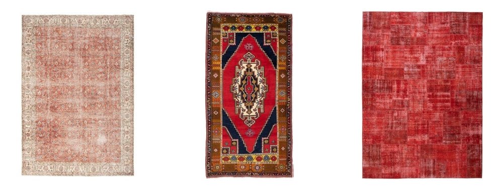
The living room can handle more. Warmer tones — rust, terracotta, deep red — make a room feel alive without being aggressive. If you lean toward color anywhere in the house, this is the room to do it. Our red rugs and blue rugs perform best where there's enough floor for a strong color to breathe.
Bedroom
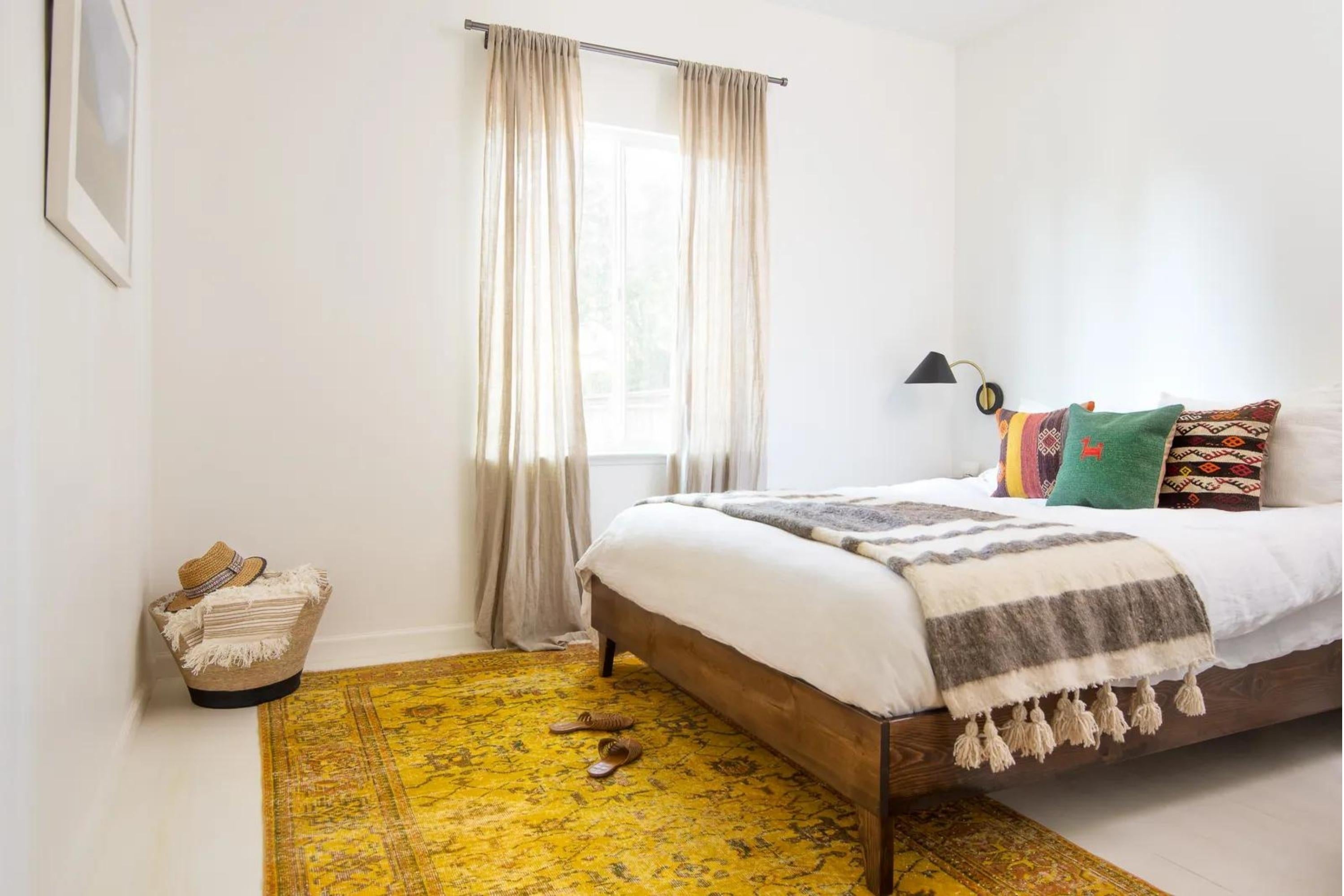
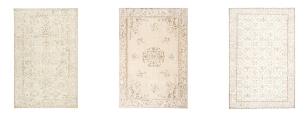
This is where most buyers go too bold — and regret it. A bedroom should feel easy at night and easy in the morning. Colors that feel exciting in a showroom can start to feel demanding after a few months. Sand, warm ivory, soft earth tones hold up over time and pair with nearly every bedding palette. Our beige and natural-toned rugs were chosen with exactly this room in mind.
Dining Room and High-Traffic Areas
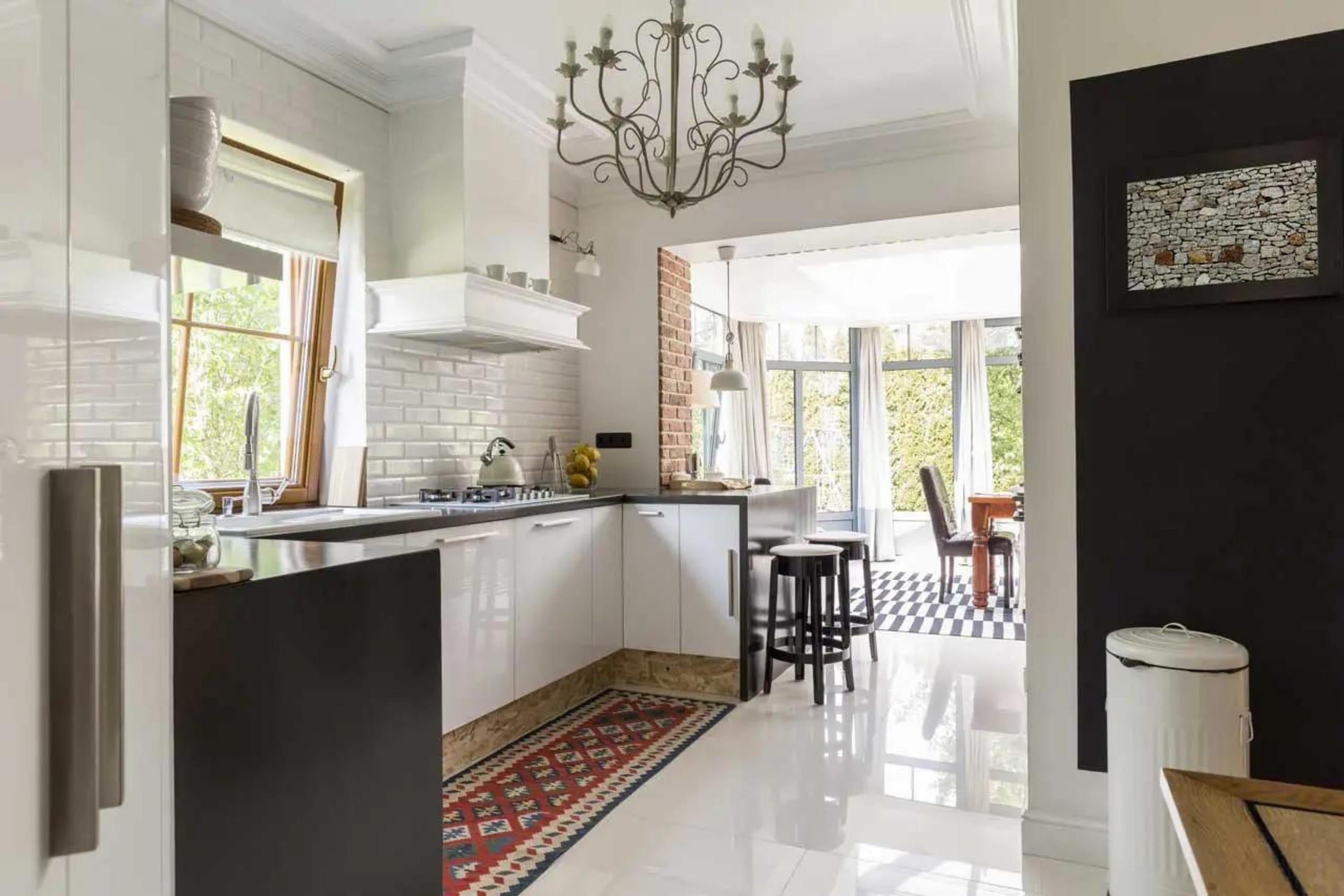
The dining room needs something that won't show every crumb or chair drag. Mid-depth tones in warm earthy ranges — camel, warm brown, muted olive — handle daily use well. A little pattern handles it even better. This is also where the natural tonal variation in a handwoven rug becomes a practical advantage. More on that below.
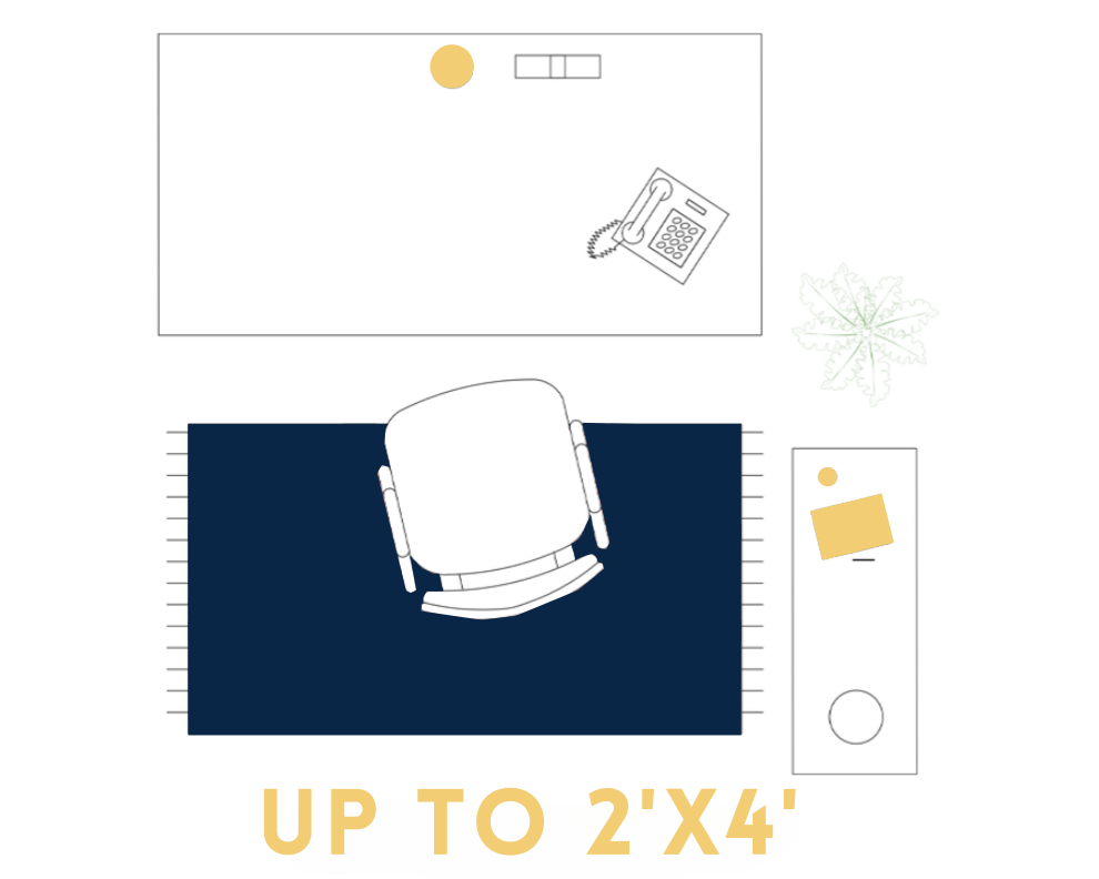
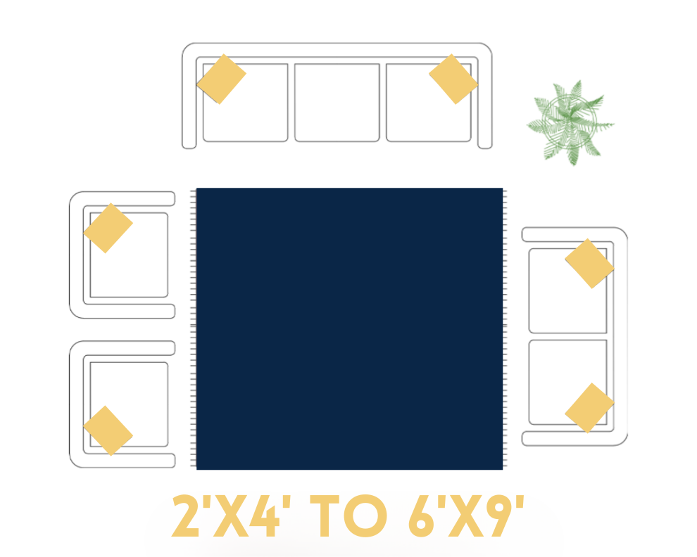
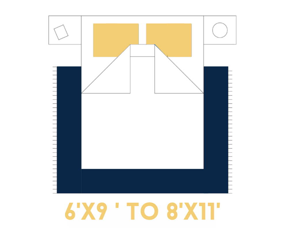
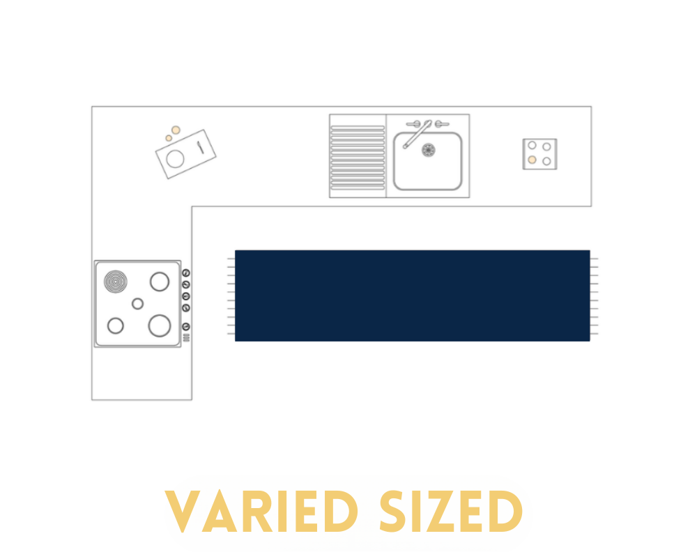
Small Room or Large Room? Let Color Do the Work
For small rooms: go lighter. A pale ivory or sandy tone reflects light and gives the room air. Our small rugs lean toward lighter palettes for exactly this reason.
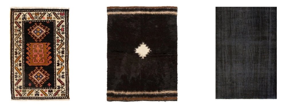
For large rooms: don't fear depth. A generous space can absorb a darker rug without feeling heavy — and a very pale rug in a large room often disappears, leaving the furniture without an anchor.
I used to get this wrong. I assumed anyone with a large room wanted contrast, so I'd push toward lighter options. But some of the most settled rooms I've seen had a deep indigo or richly toned rug pulling everything together. The darkness wasn't closing the space in. It was giving it a center of gravity.

Why Handwoven Rug Colors Are Never Quite “Flat”
What Is Abrash, and Why We Don't “Fix” It
Abrash is the natural tonal variation in a hand-knotted rug — a subtle shift within a color field, a band running slightly lighter or deeper than the rest. It comes from the way wool takes dye: in small batches, in natural conditions, with slight differences between one lot and the next.
The first time a customer notices it, the reaction is almost always the same: Is that a defect?
A customer once contacted us certain her kilim had arrived damaged. She pointed to a lighter band across the field. I showed her the same band in a photo taken from a different angle — it nearly disappeared. Then I explained: the weaver who made this piece didn't have synthetic dye tanks or a color-matching system. She was working with natural materials, at a specific moment in time.
That tonal shift is the record of it. Not a flaw — proof that a real hand worked through this particular piece. She wrote back a week later to say she loved it more for knowing that.
Where Our Colors Actually Come From
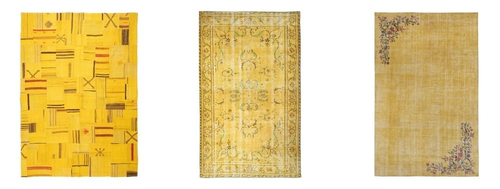
Madder root produces the reds and warm oranges. Indigo gives the blues. Walnut shells and husks yield the warm browns and tans.
Growing up in Anatolia, I knew these plants long before I knew them as dye sources. Walnut trees — ceviz — were everywhere. The color that comes from boiling the shells isn't a clean mahogany; it's warmer, more layered. When I see that tone in a vintage rug now, I recognize it the way you recognize a smell from childhood.
This Is Also Why These Colors Age So Well
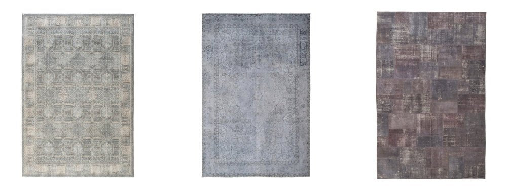
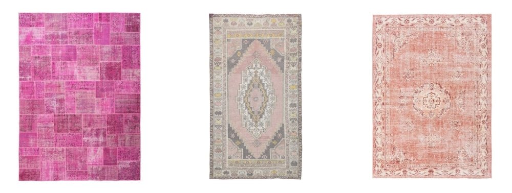
Natural dyes don't fade the way synthetic dyes do. A synthetic dye shifts — a red pulls toward orange, a blue goes chalky. A natural dye softens. The tone mellows rather than changing character. After ten or twenty years, a naturally dyed rug looks like a better version of itself. Our vintage rugs collection shows what that looks like across several decades of real use.
Common Rug Color Mistakes to Avoid
- Matching everything too exactly. A room where rug, wall, sofa, and curtains are all versions of the same tone reads flat. Some contrast is not a mistake — it's usually the point.
- Testing color only under artificial light. Rugs look different in daylight. Evaluate any sample in the actual room during the day before deciding.
- Choosing a trend color without a long horizon. Earth tones and neutrals outlast seasonal palettes by years.
- Confusing “matching” with “working.” A rug needs to work with your furniture — which often means contrast, and finding one shared tone between them.
- Deciding from a small photo. Rug color shifts at scale. Something that looks bold in a thumbnail can read completely differently across ten feet of floor.
Quick Reference: Floor Color → Rug Color
These are starting points, not rules. The goal is a floor and rug that feel intentional together — not so closely matched the rug disappears, not so sharply contrasted it looks accidental.
Final Thoughts: Trust Your Room, Not Just the Trend
Color trends move faster than rugs do. A handmade rug bought today can live with you for twenty years. The customers I hear back from most — the ones genuinely happy months later — are almost never the ones who picked the trending color.
They're the ones who paid attention to what the floor asked for, what the furniture needed, what the light did at different hours. They let the room lead. Then they trusted it.
We curate every piece in our collection with that kind of long-term use in mind. Browse by color — the full range runs from deep jewel tones to the quietest naturals, and seeing options grouped by palette usually makes the decision faster than you'd expect.
Frequently Asked Questions
What color rug goes with everything?
Warm neutrals are the safest choice: ivory, beige, sand, camel, soft brown, and faded grey. These colors work with most sofas, wood tones, and wall colors without feeling cold.
Should a rug be lighter or darker than the floor?
Usually, the rug should create contrast with the floor. Dark floors often look better with lighter rugs. Light floors often need a mid-tone or darker rug to ground the space. The goal is for the rug to be visible without looking harsh.
What rug color makes a room look bigger?
Light colors such as ivory, beige, pale blue, and soft grey can make a room feel larger because they reflect more light. Low-contrast patterns also help small rooms feel less crowded.
What rug color hides dirt best?
Mid-depth colors with pattern hide daily wear best. Camel, brown, muted red, olive, faded blue, and traditional patterned rugs are more forgiving than very pale solid rugs.
Can I use a colorful rug in a neutral room?
Yes. A neutral room is often the best place for a colorful rug. The rug can become the main character while the sofa, walls, and curtains keep the room balanced.
What color rug works with a grey couch?
For a cool grey couch, blue, blue-green, charcoal, and soft ivory work well. For a warm grey couch, beige, camel, brown, faded red, and terracotta usually feel more natural.
Are vintage rug colors different from new rug colors?
Often, yes. Vintage rugs usually have softer, more layered color because of age, wool, natural dyes, handwashing, and abrash. This is why a vintage red or blue rug can feel calmer than a bright new synthetic rug.
What is abrash in a rug?
Abrash is the natural variation of color in a handmade rug. It can appear as lighter or darker areas within the same color field. In vintage and handwoven rugs, abrash is usually considered character, not a defect.